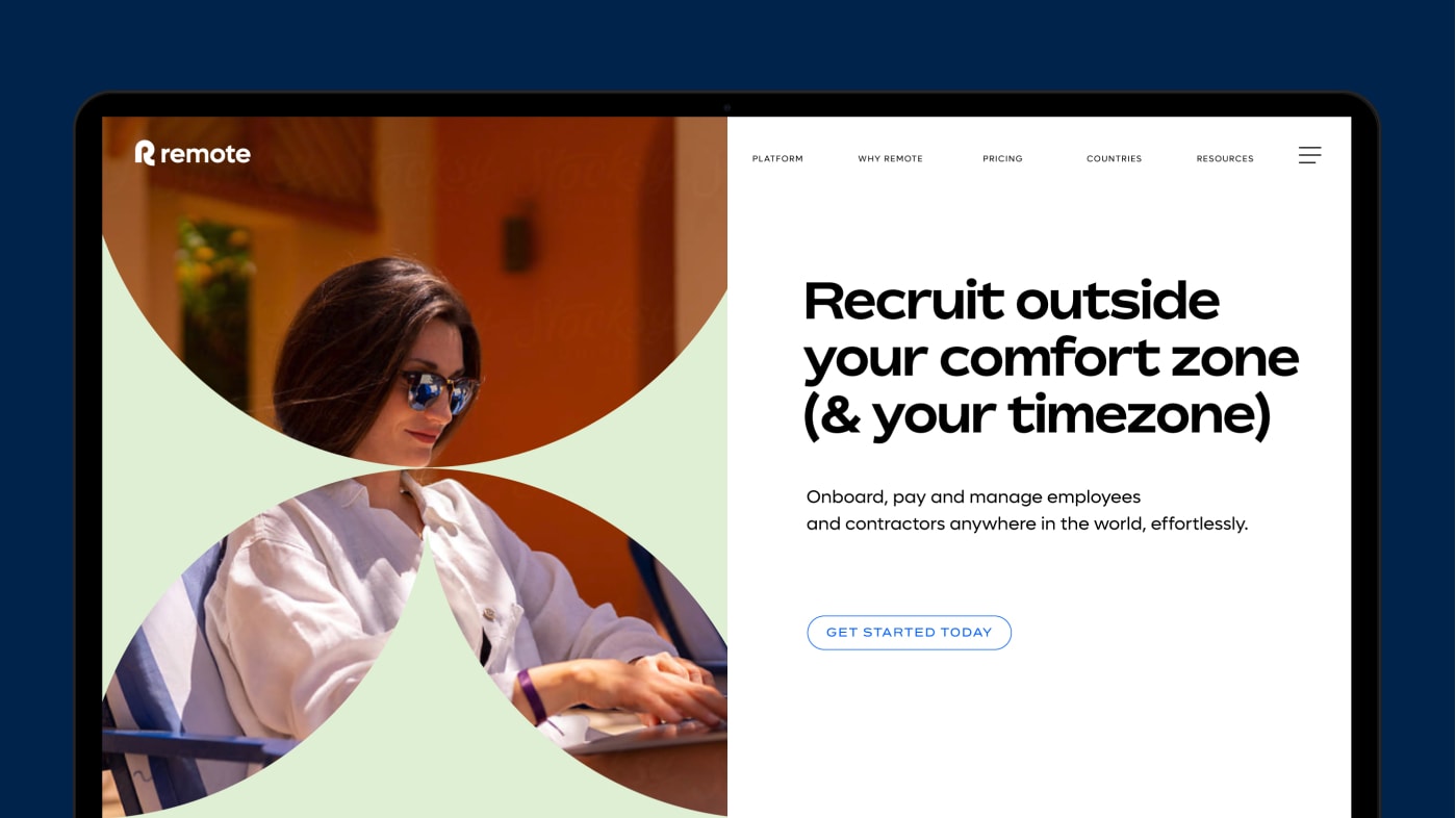
Typography
Our typography is modern while also feeling human and friendly, helping us stand out from our competitors.

Type styles
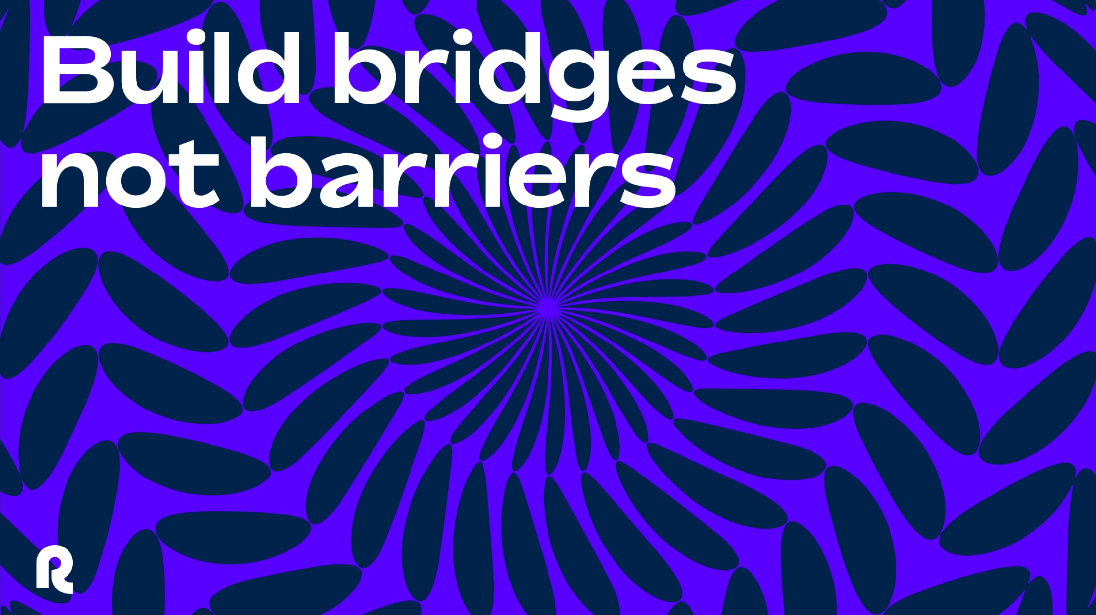
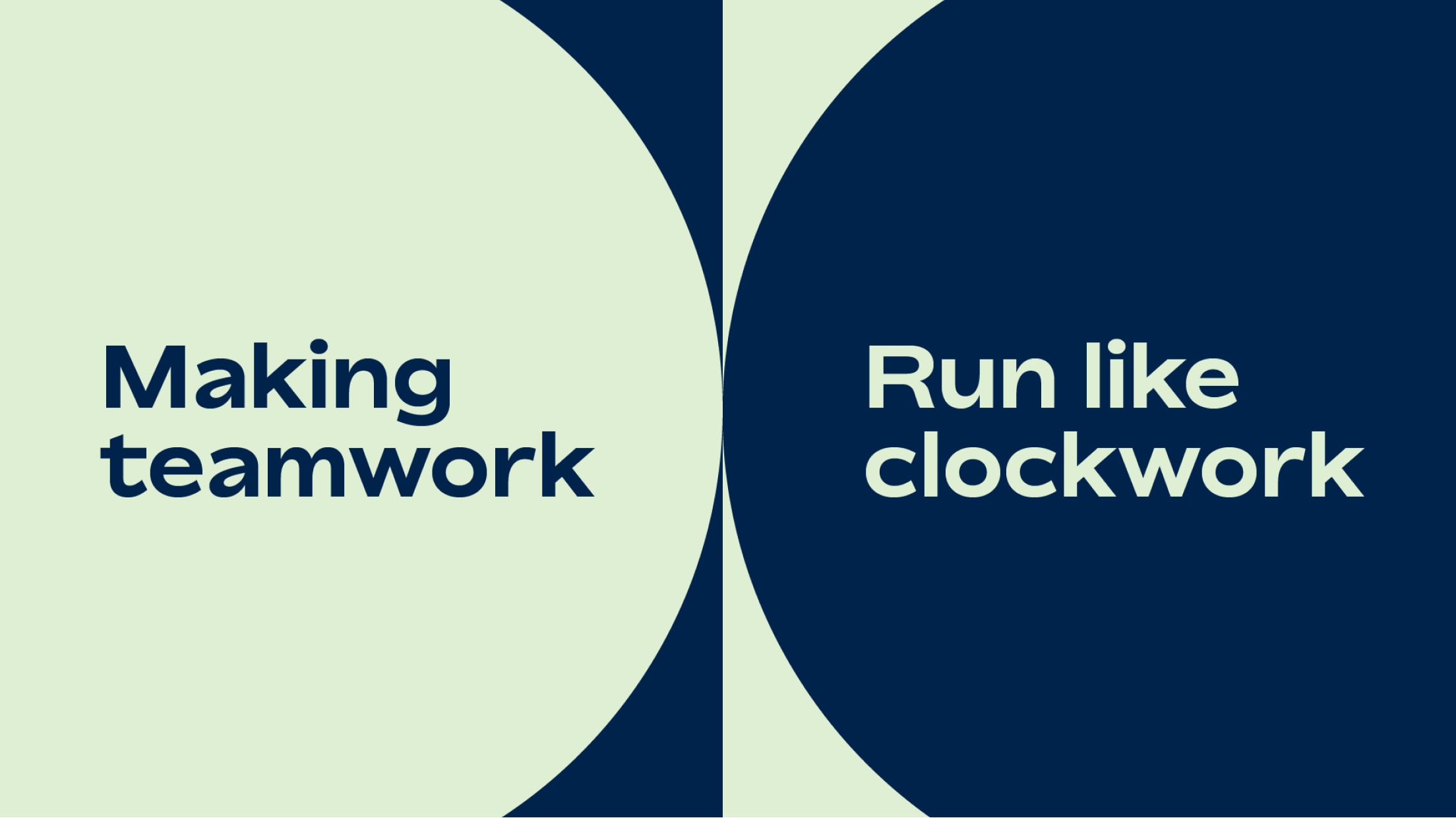
We have two key typefaces. Bossa, a friendly typeface with character, is used for headings and subheadings. Remote, our bespoke typeface created for maximum legibility, is used across all body copy.

Type tester
Type something, select the style and colour and see what your message will look like!
A
A
abcdefghijklmnopqrstuvwxyz
ABCDEFGHIJKLMNOPQRSTUVWXYZ
1234567890 BOSSA - BOLD
ABCDEFGHIJKLMNOPQRSTUVWXYZ
1234567890 BOSSA - BOLD
abcdefghijklmnopqrstuvwxyz
ABCDEFGHIJKLMNOPQRSTUVWXYZ
1234567890 BOSSA - MEDIUM
ABCDEFGHIJKLMNOPQRSTUVWXYZ
1234567890 BOSSA - MEDIUM
abcdefghijklmnopqrstuvwxyz
ABCDEFGHIJKLMNOPQRSTUVWXYZ
1234567890 REMOTE SANS - REGULAR
ABCDEFGHIJKLMNOPQRSTUVWXYZ
1234567890 REMOTE SANS - REGULAR

Things to avoid
To ensure we keep a type hierarchy that both works well and look its best, make sure to steer away from any of the following:

Do not use a font style that does not match those outlined in the hierarchy

Do not introduce typefaces not specified by the brand

Do not apply effects to the type, such as shadows, gradients or outlines

Do not stretch or distort type

Do not rotate type at angles

Do not use colour pairings that are illegible, or do not pass accessibility for web
Examples
Photography