Logo
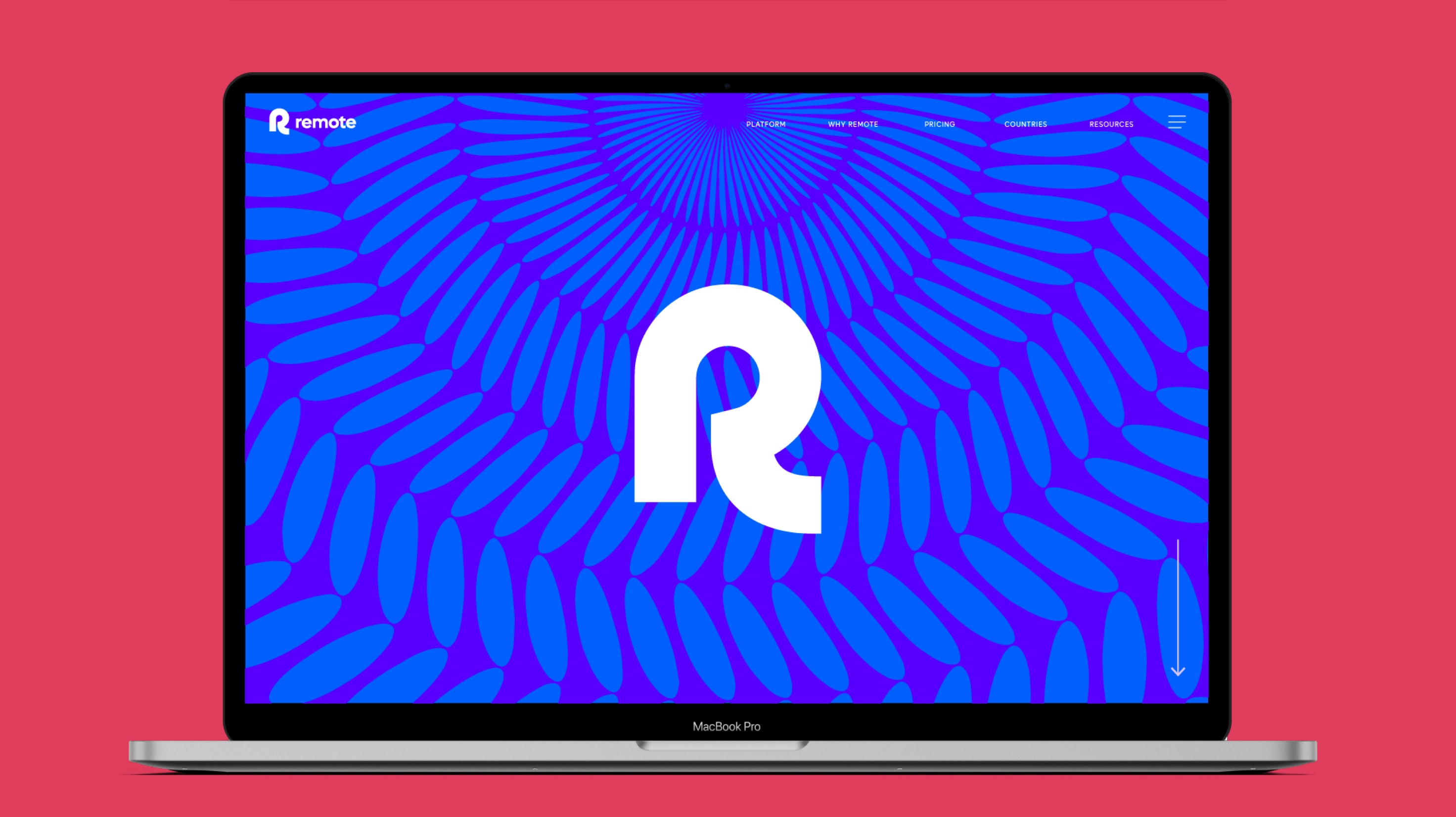
Our logo is bold, ownable and captures the sense of reaching out and getting closer which is central to our proposition.

Our symbol
Our logo symbol represents us and sets us apart from our competitors.
Its simple and friendly geometry takes inspiration from our proposition.
Logo masters
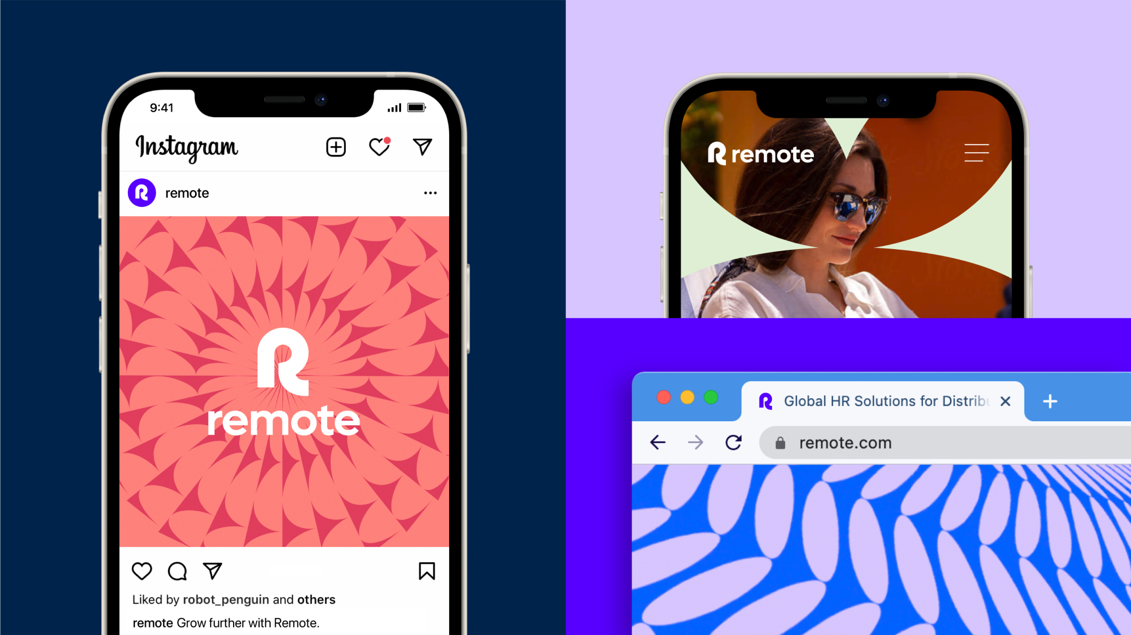
Our master logos are used in horizontal and centred lockups. Our logos can be used in various colour combinations, these are some of these examples. Make sure you always use colours that ensure maximum legibility, use your best judgement here.
Small usage logos
Our small usage logos are specifically designed for use at smaller sizes, for example as a favicon or product logo. Do not use these for normal use cases, for everything else use the lockups above.
Logo clear space & minimum sizes
Please follow these rules on logo clearspace in order to ensure there is adequate
spacing throughout touchpoints and our logos are always legible.
Partnership lockups
When locking up partnership logos please use the following clearspace and lockup rules both in horizontal and vertical versions.
Internal logos
When creating future Remote internal logos please follow these guidelines on how to create lockups and use clearspace, both in horizontal and vertical versions.

Logo usage
Logo placement
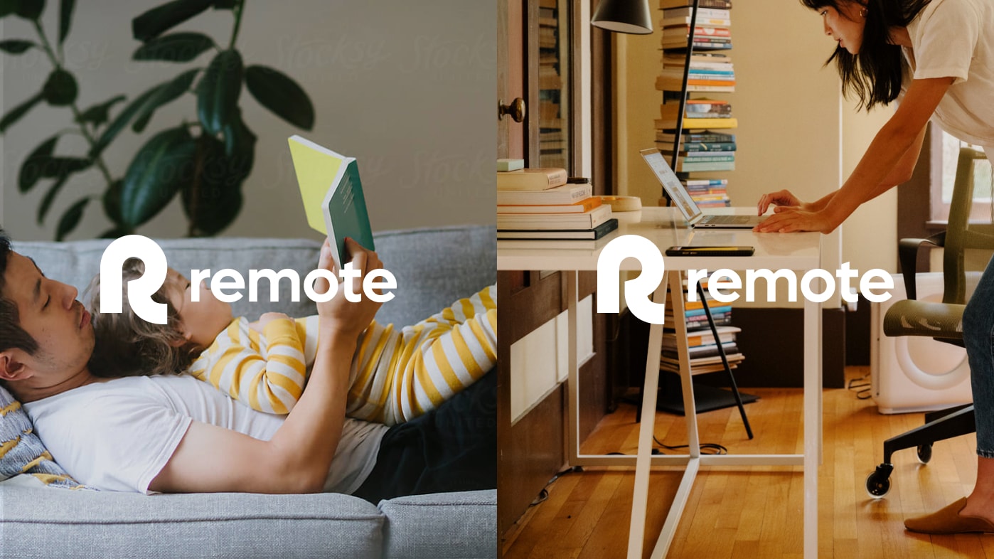
When placing your logo, make sure it’s a composition that gives it enough visibility. We recommend placing our horizontal logo at the bottom left side of the visual, left aligned or alternatively using our stacked lockup and centrally aligning your type and logo.
The cap height of your type should match the height of the R symbol. For type sizes below 15 pt the cap height of your type should match the height of the stem of the R symbol. Please use your best judgement here, to ensure legibility.
Things to avoid
To ensure the Remote logo always looks clear and consistent, here are a few things you should avoid at all costs.
Do not add any gradients or other colourways to our logo

Do not use a keyline on the logo
Do not add any other descriptors or taglines
Do not skew or add effects to the logo

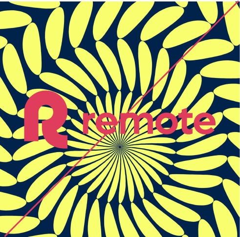
Do not use logo over patterns with too much contrast
Do not use poor contrasting colours


