Layout
Our toolkit is flexible and rich in possibility for both layout and visual expression.

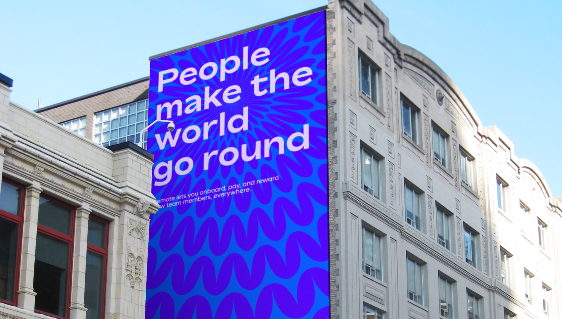
Shape layout with type
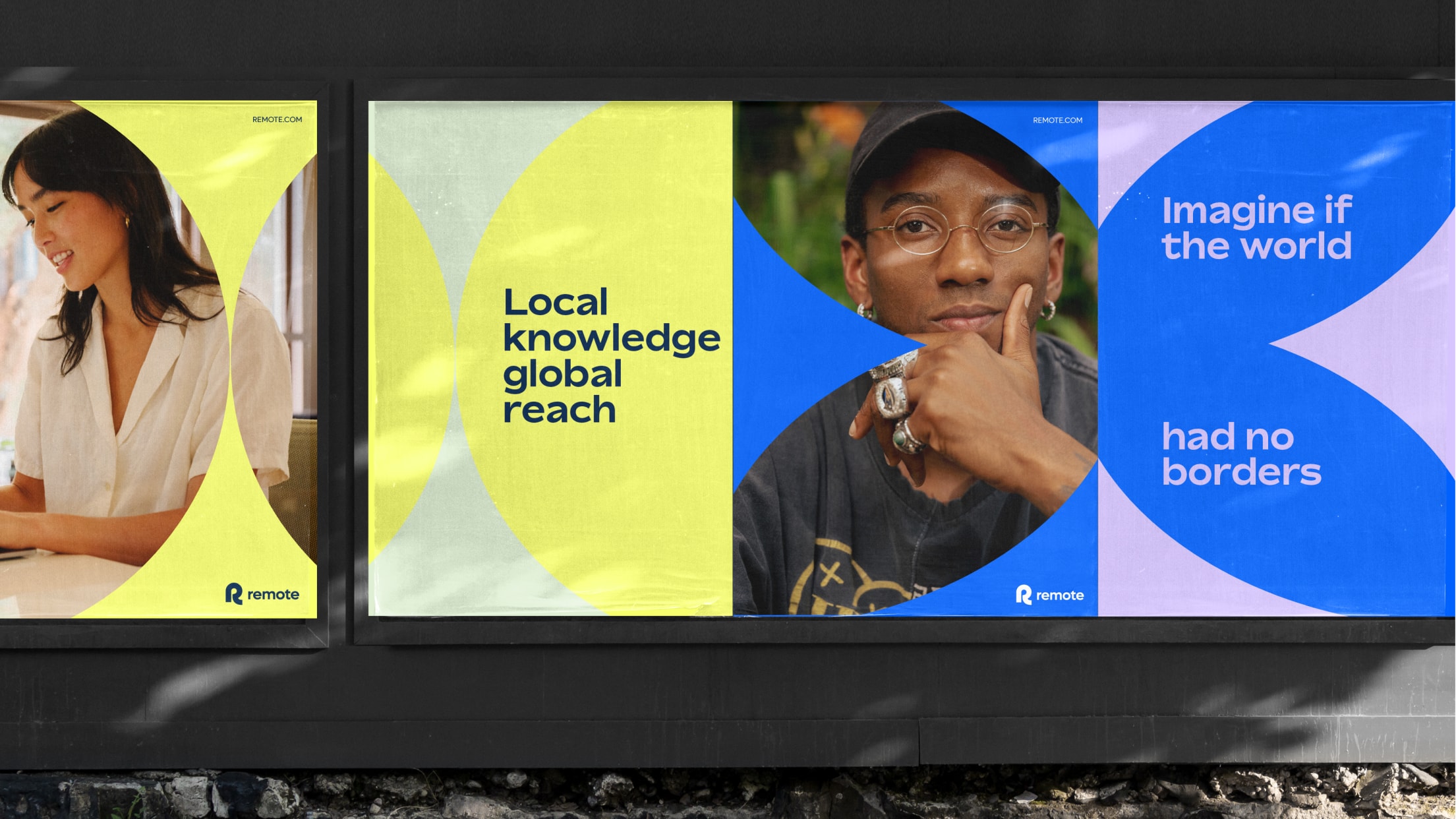
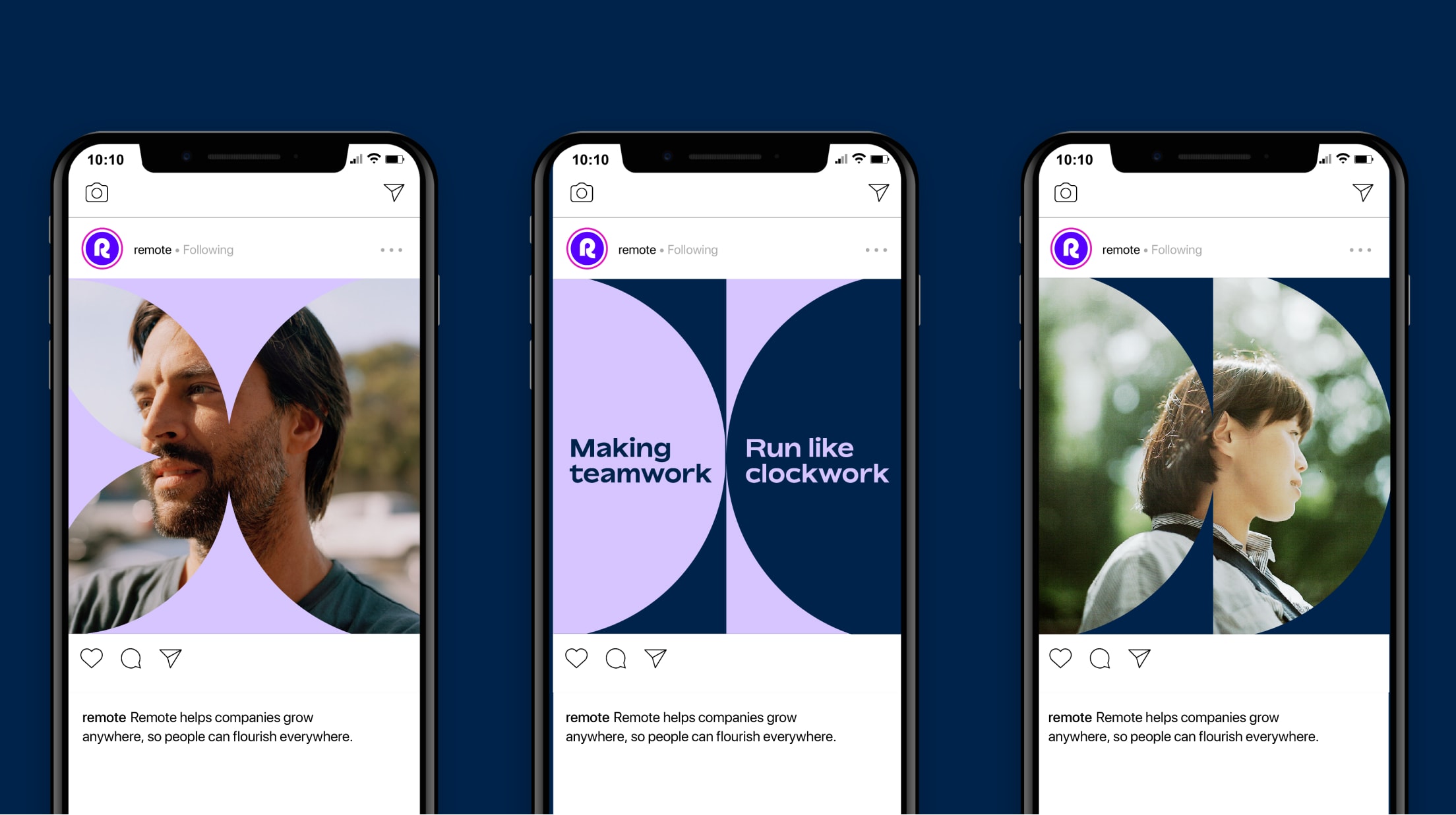
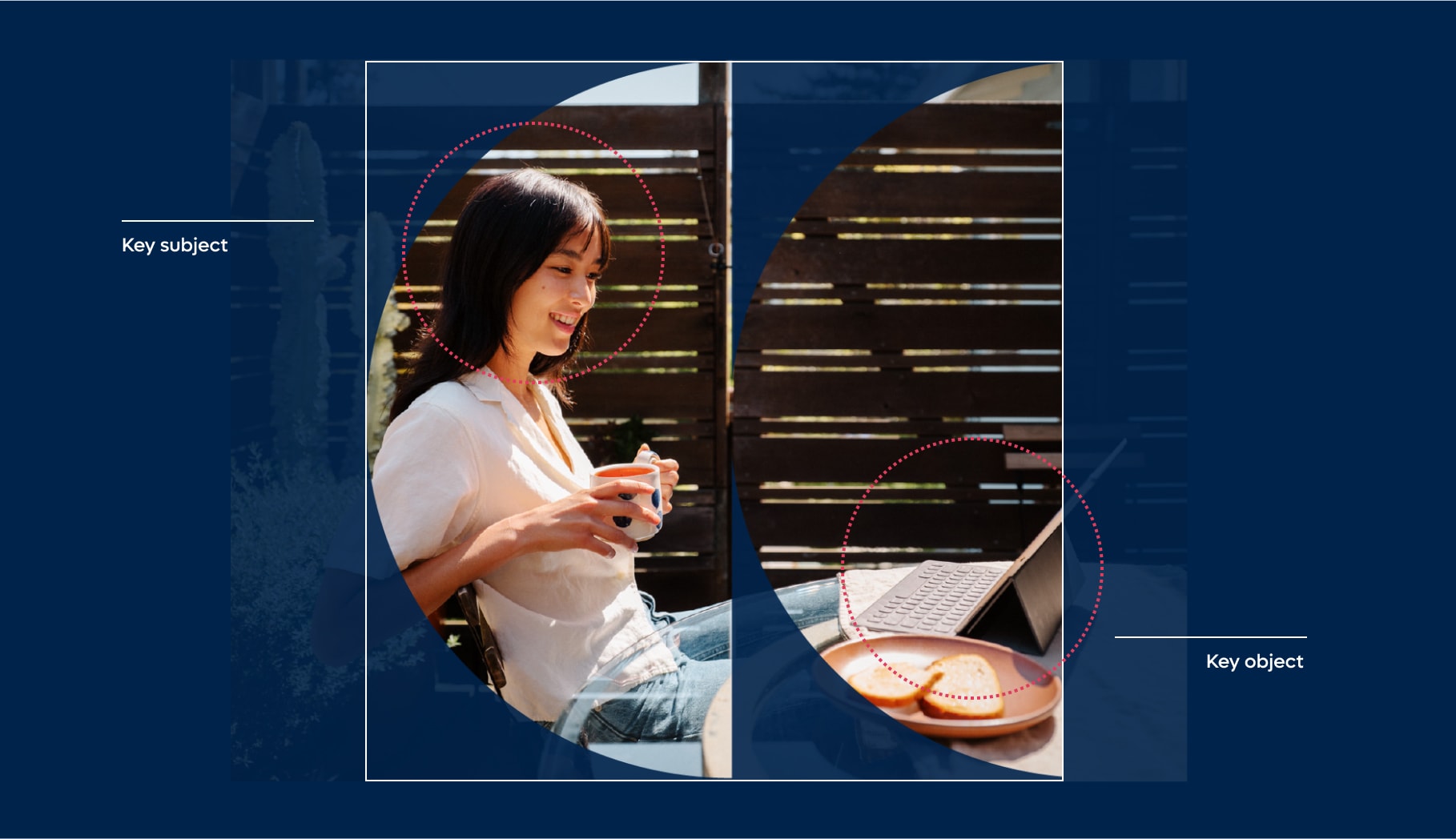
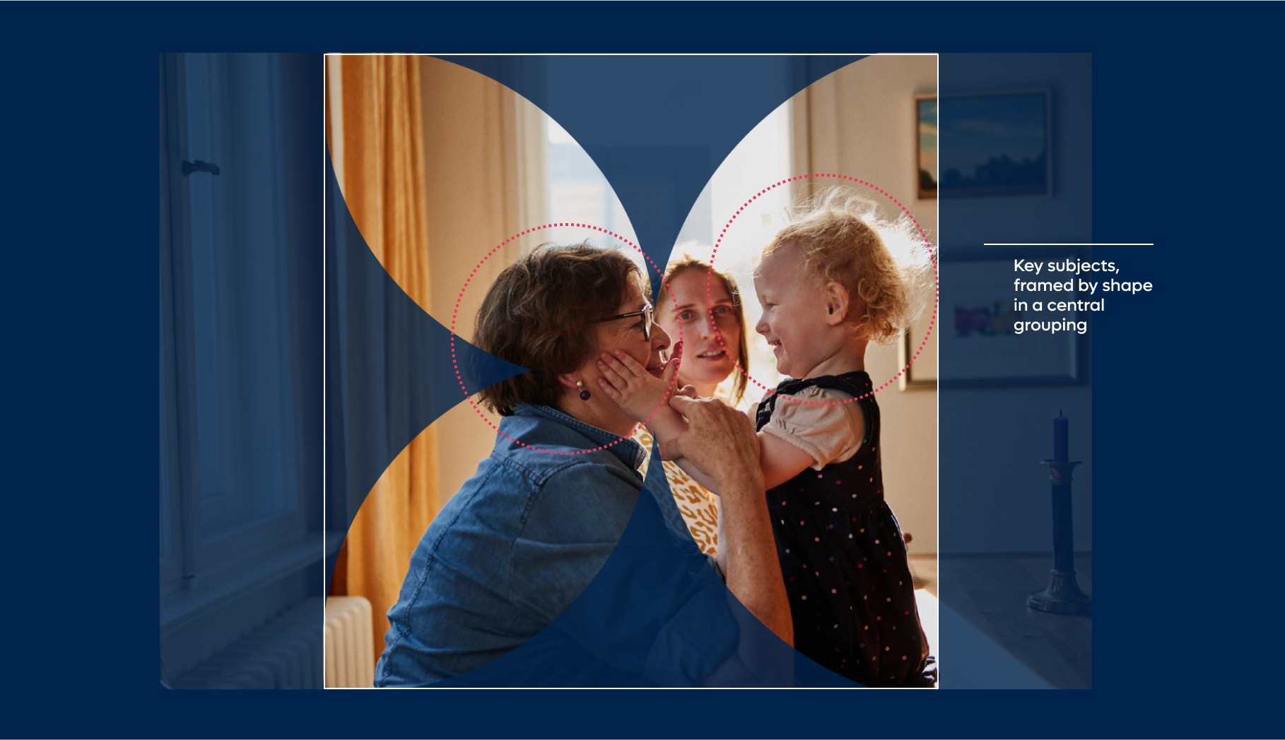
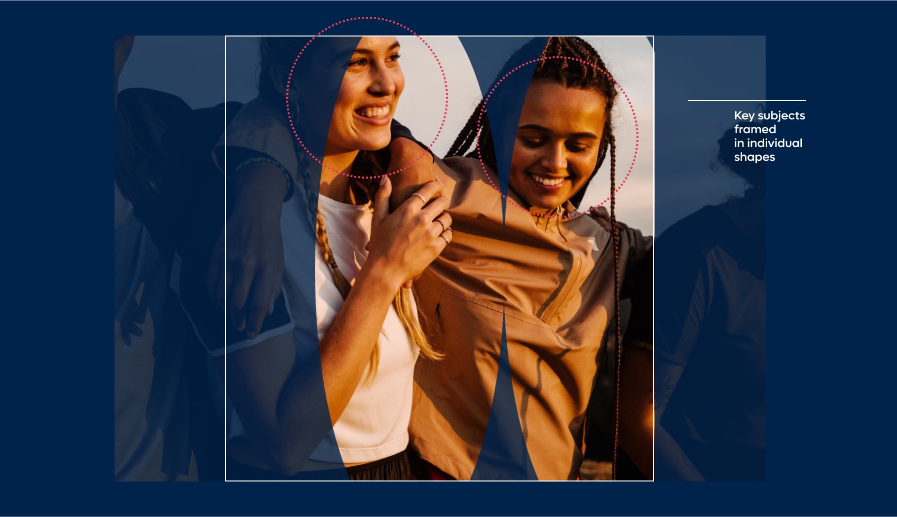
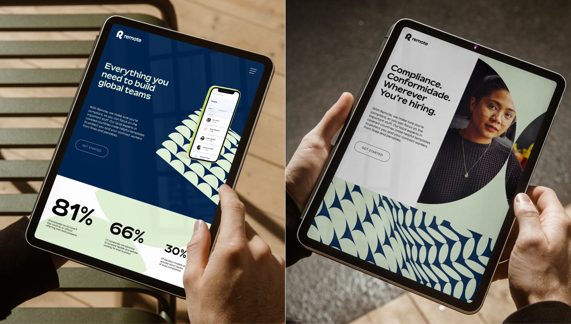
Shape layout with art direction
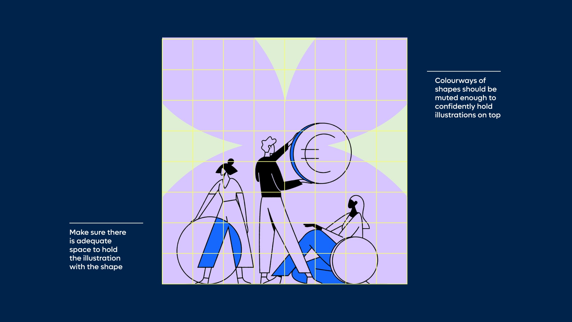
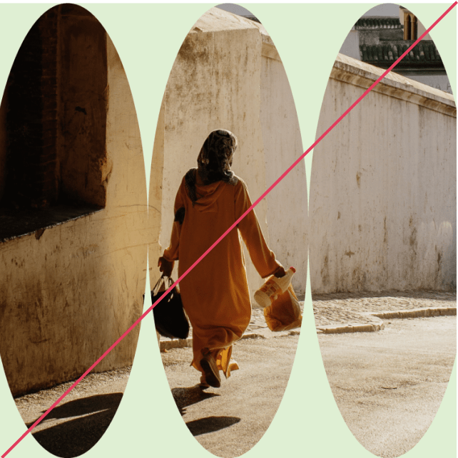
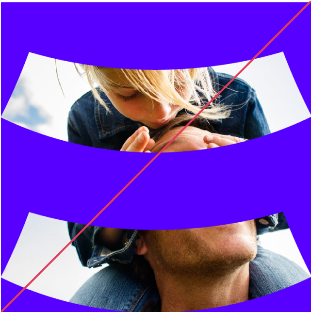
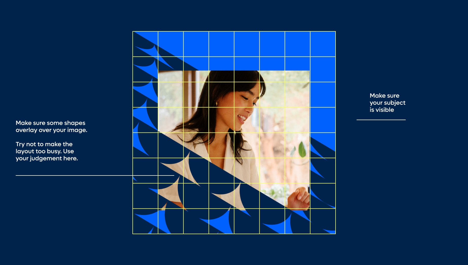
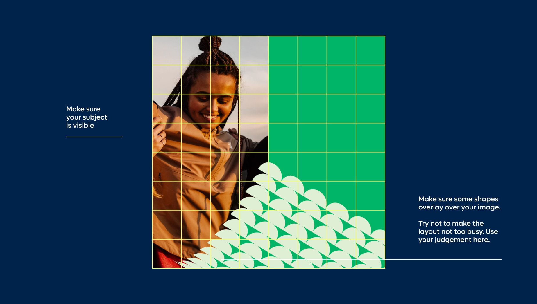
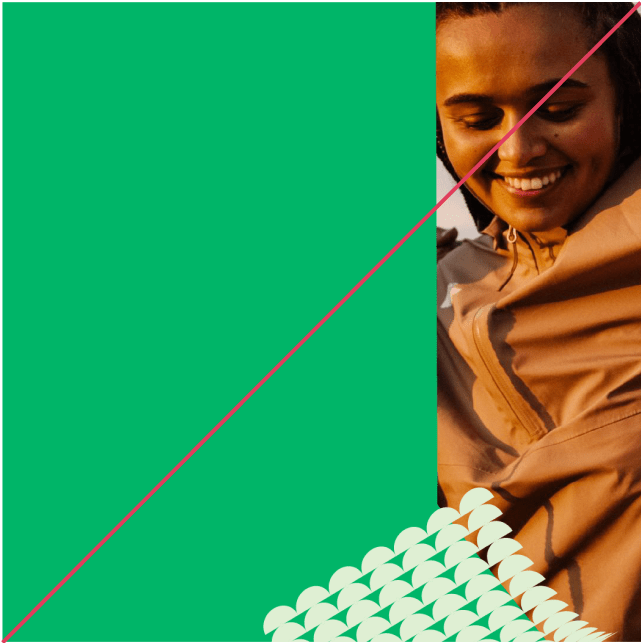
Our shape layouts are great holders for art direction. Use our key shapes, or multiple key shapes, grouped to mask out images. When doing so, make sure all key subjects in the scene and visible and not being covered by parts of the surrounding shapes. Shape masks should cover the majority of your canvas.
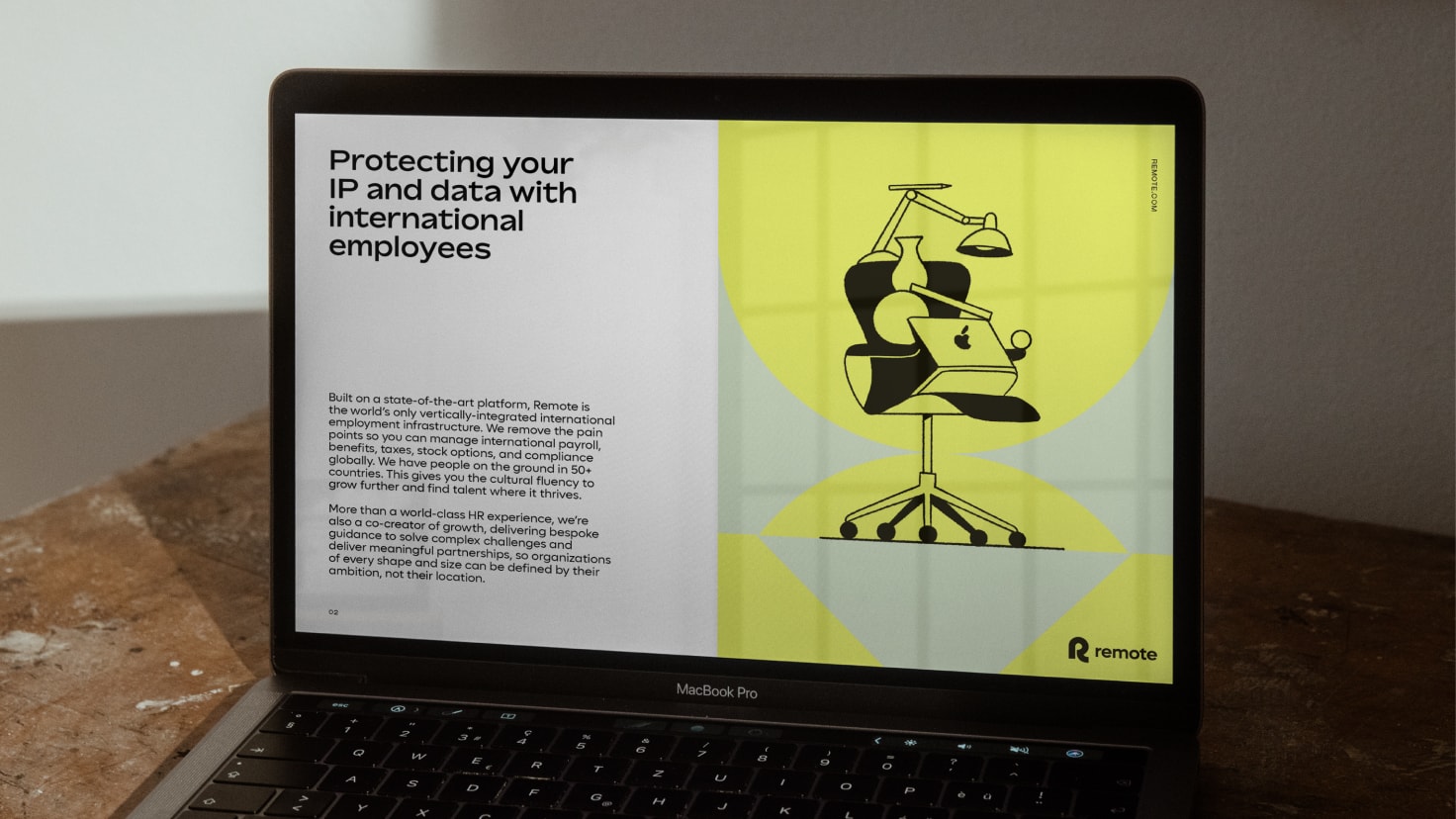
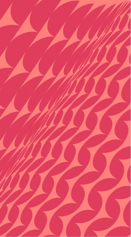
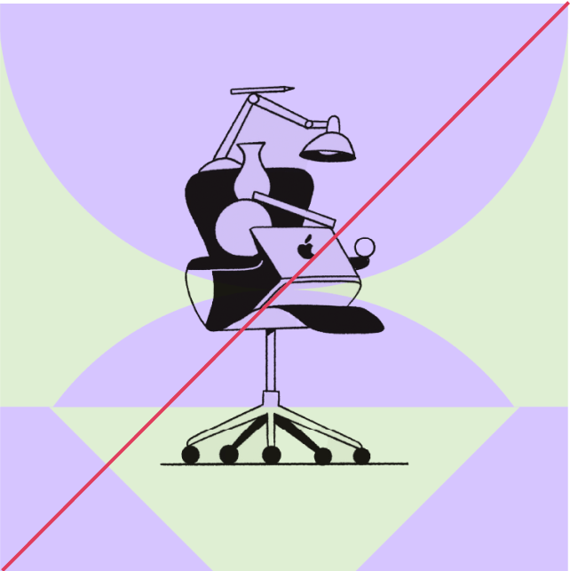
Shape layout with illustration
Things to avoid
When working with our shape layouts, please do not make the following mistakes in order to maintain consistency and legibility within the Remote brand.
Do not use light colourways without a contrasting type colour
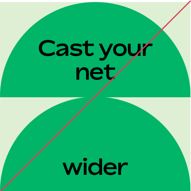
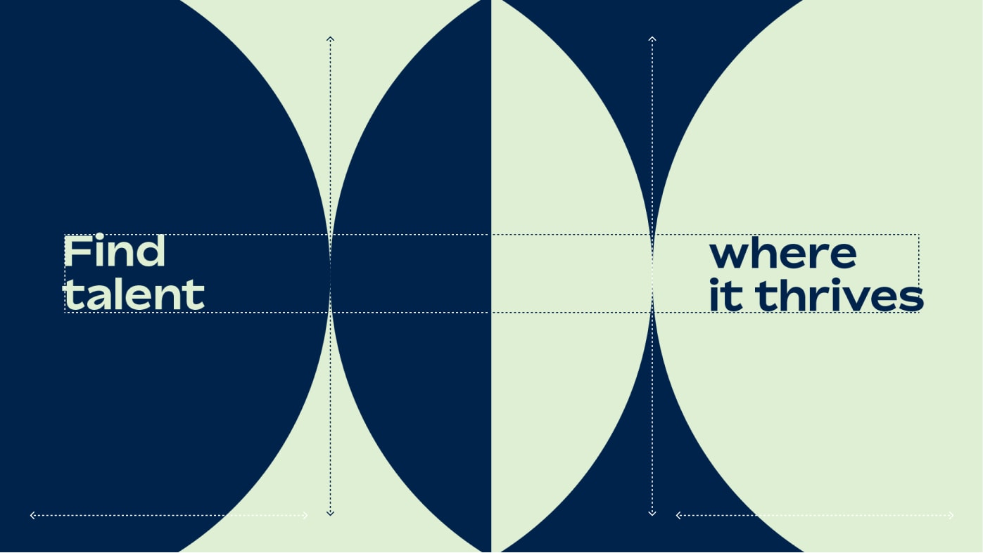
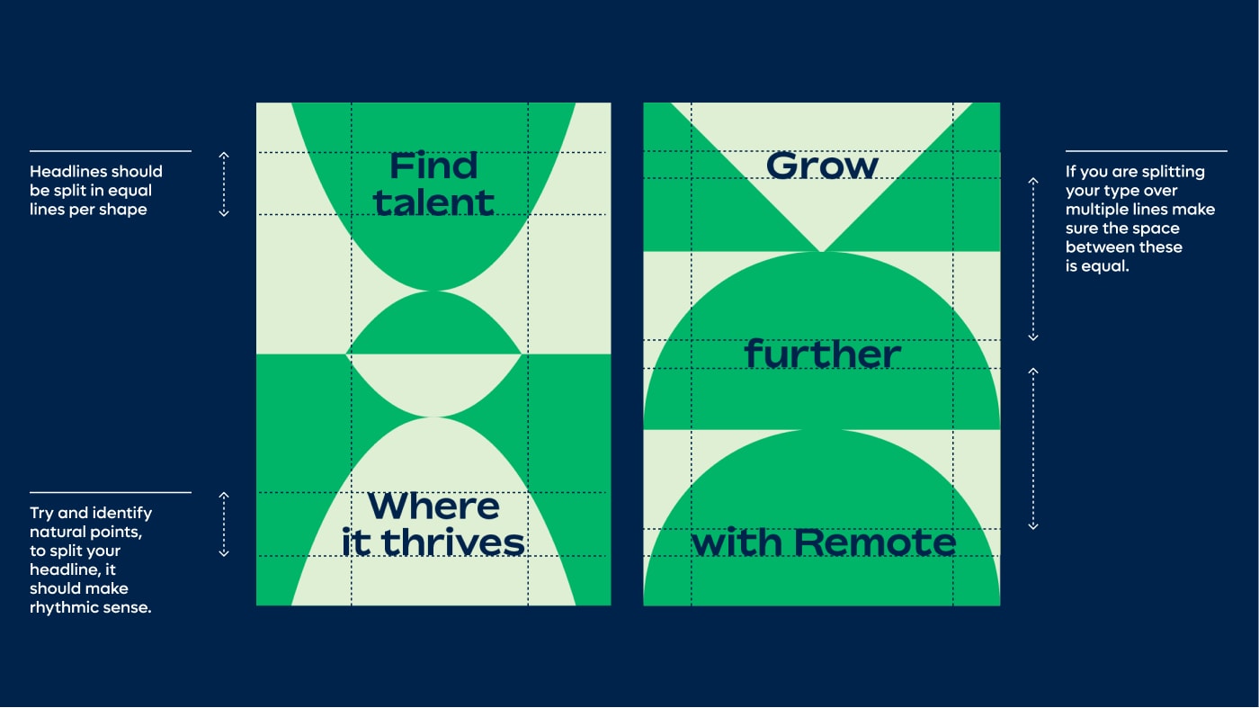
Do not break headlines in unnatural points and make sure your type is always aligned
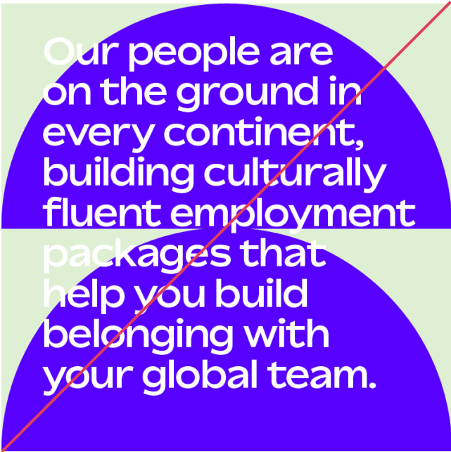
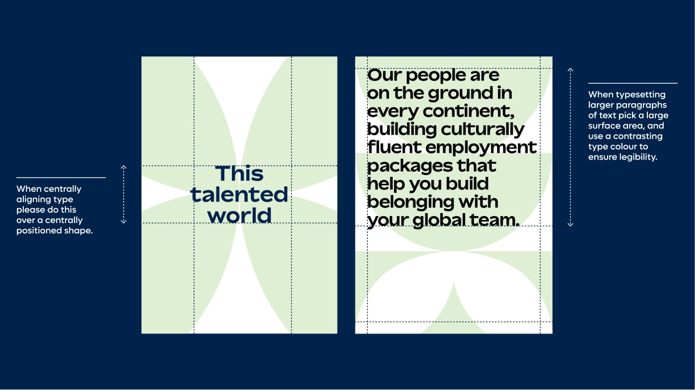
Do not overlay long paragraphs of text on top of contrasting colourways
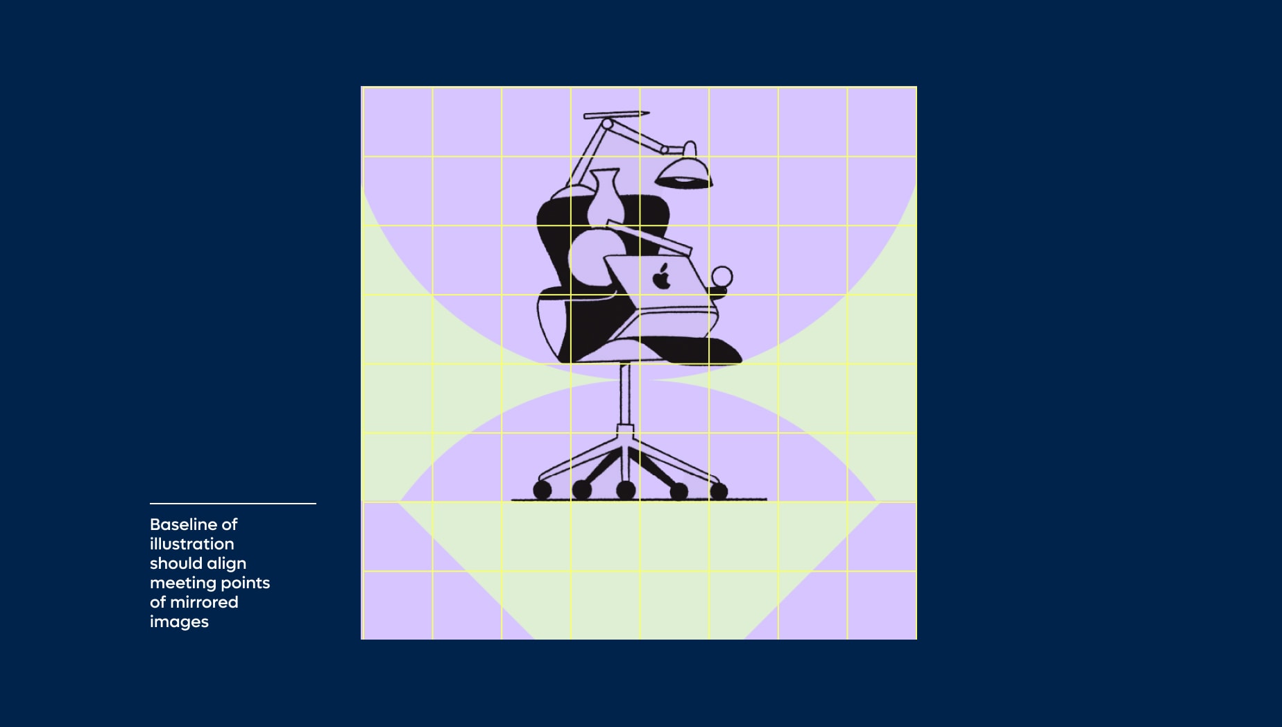
If an illustration has a natural baseline make sure it aligns with the baseline of your mirrored shape
When using multiples of a shape to mask out image, make sure the shape doesn’t create sharp points. Avoid this by moving shapes closer together
Do not space out shapes when masking out images. Shapes should be grouped together.
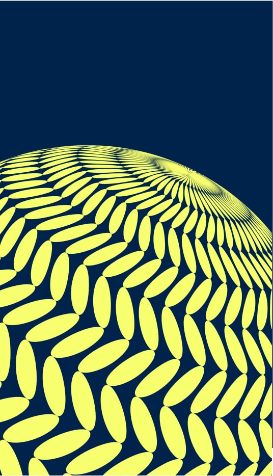
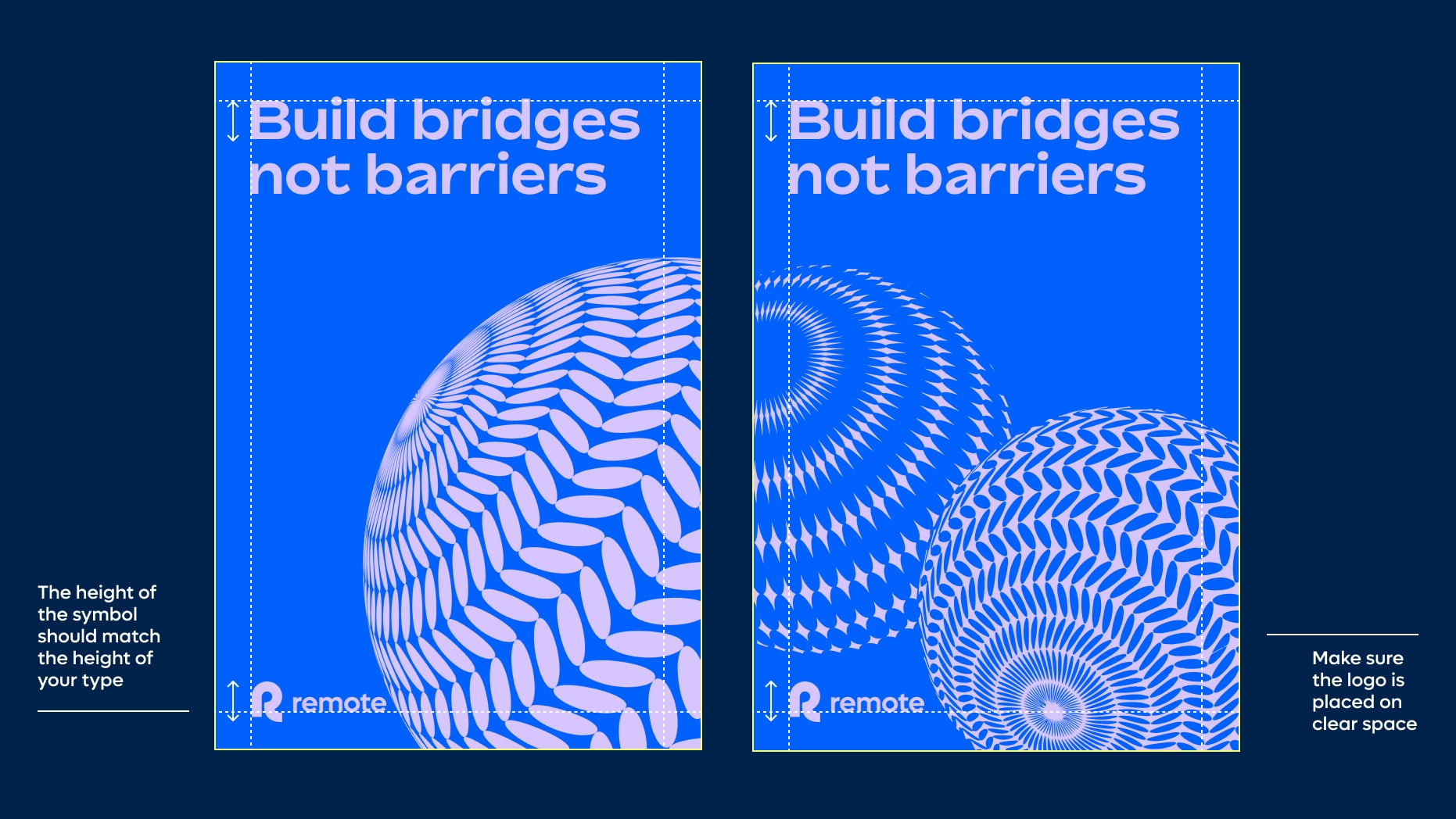
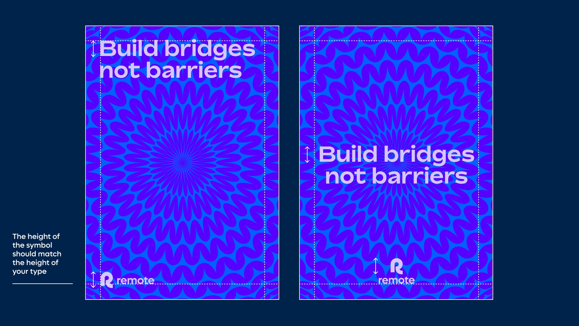
Globe layout with type
Things to avoid
To maintain consistency and legibility, please avoid the following mistakes.
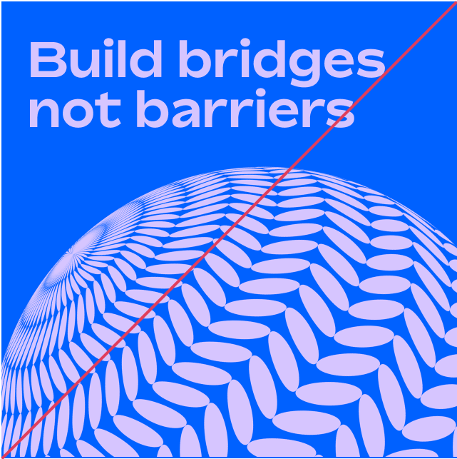
Make sure your type does not overlay your globe asset
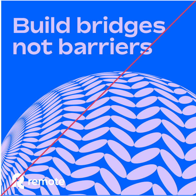
Make sure your logo does not overlap with your globe asset
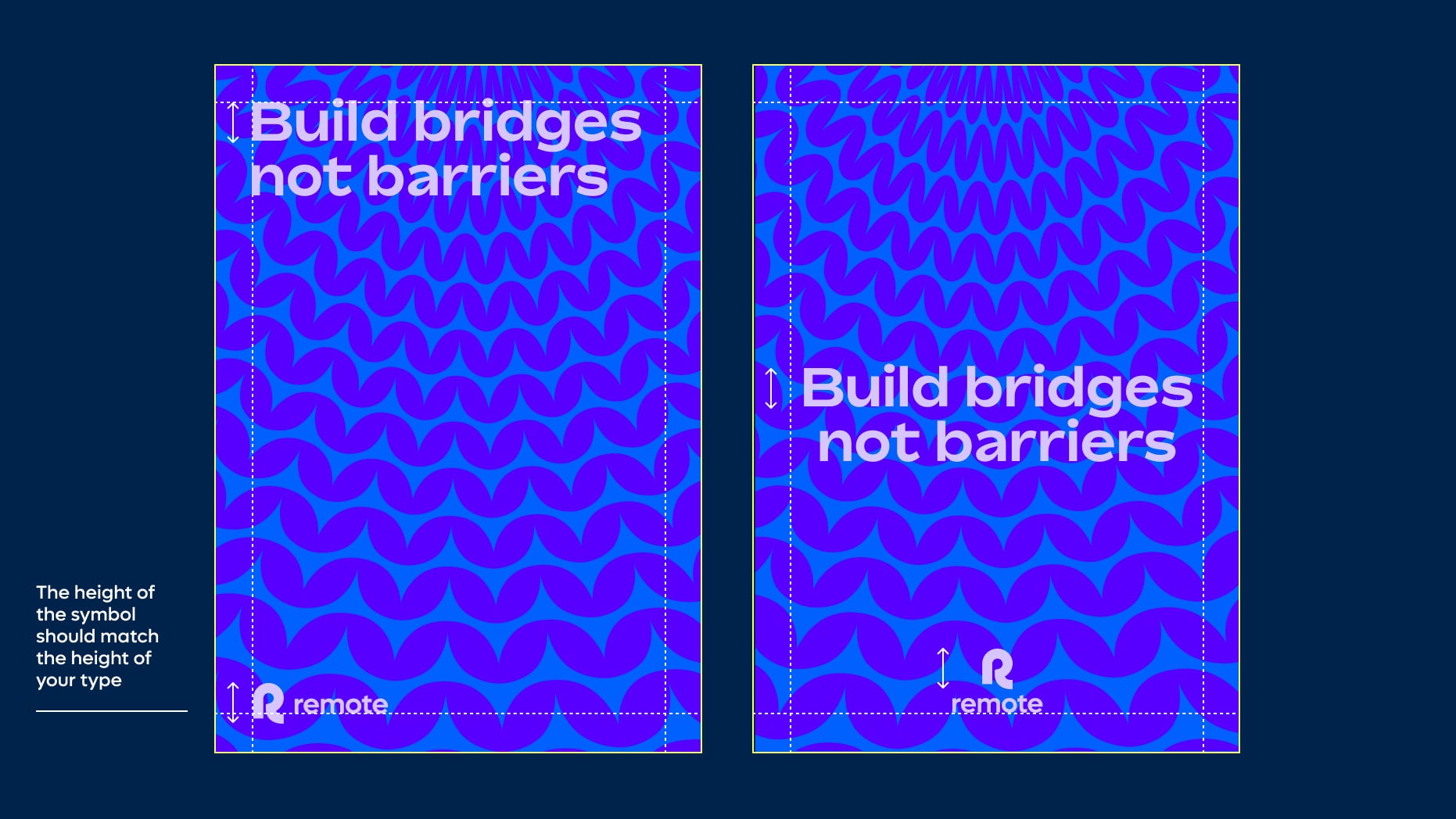
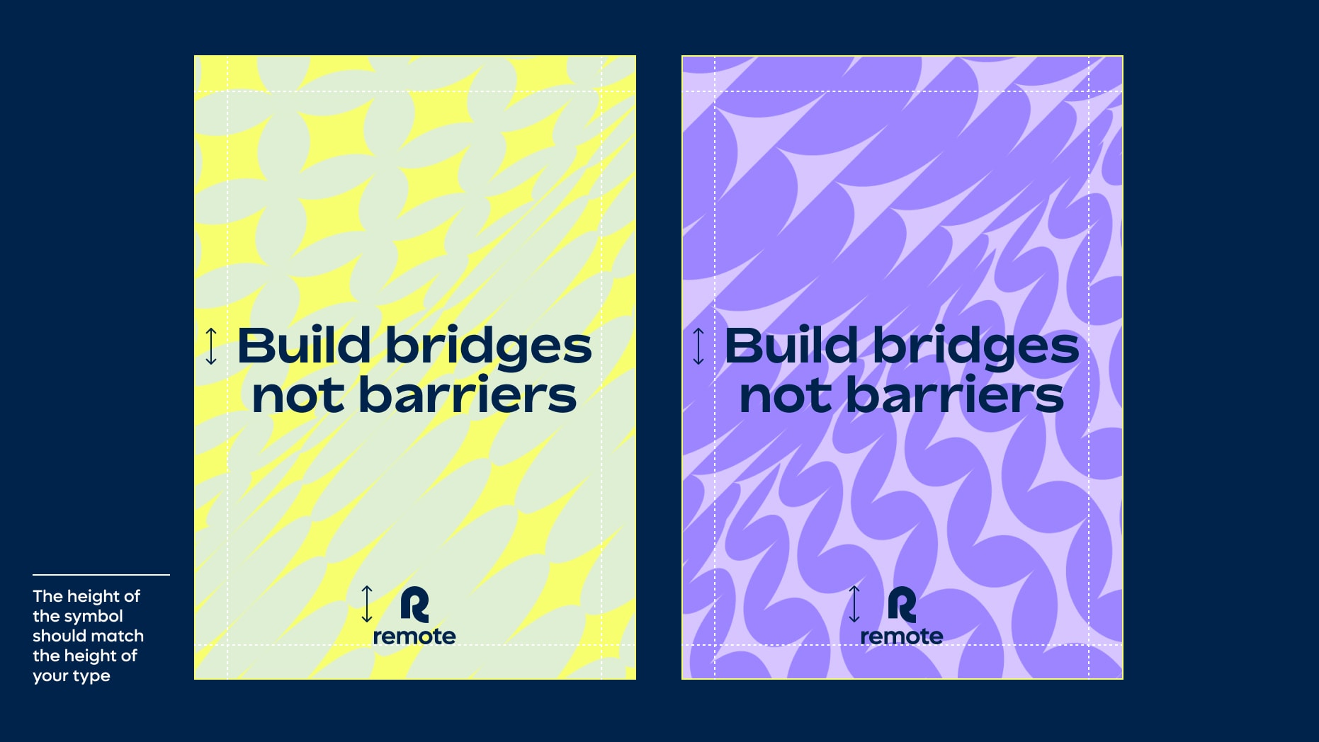
Do not make logo too big. The height of your symbol should match the height of your type
Do not use any overhead or interior globe patterns in contrasting colourways
Do not use overhead globes in the same way that rotation globes are used
Make sure your globe layouts are only set in two colours
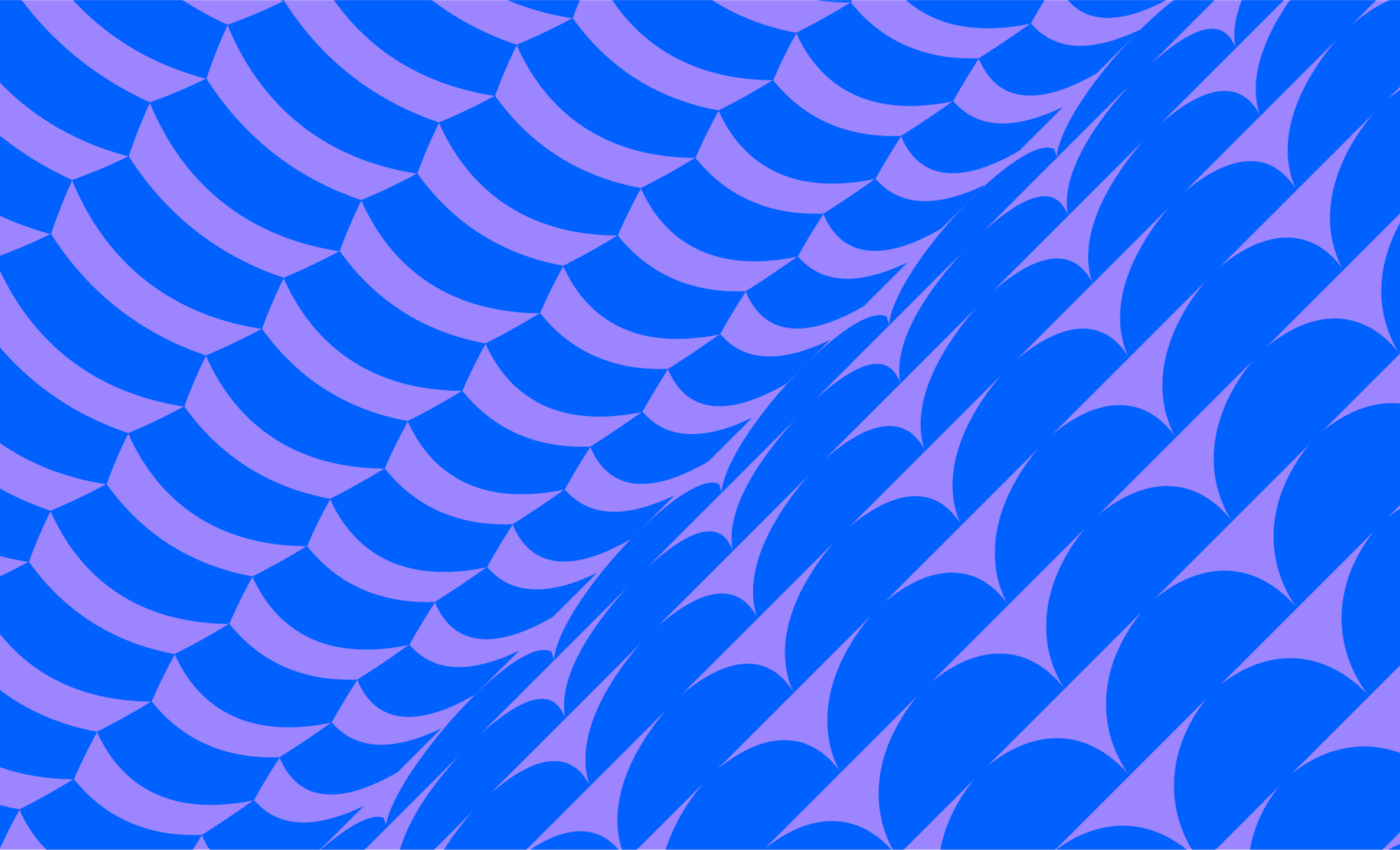
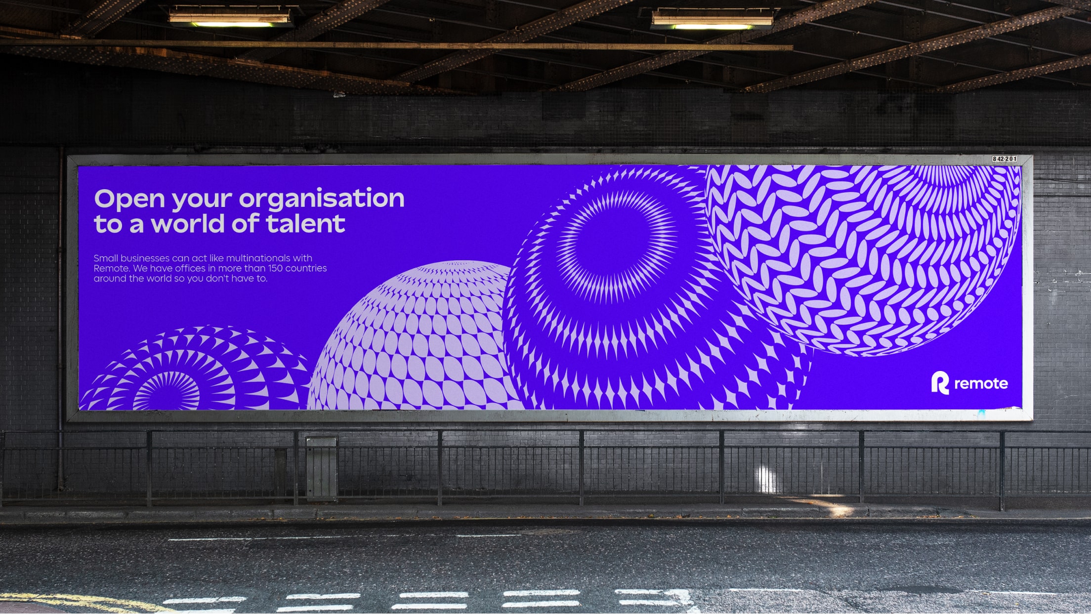
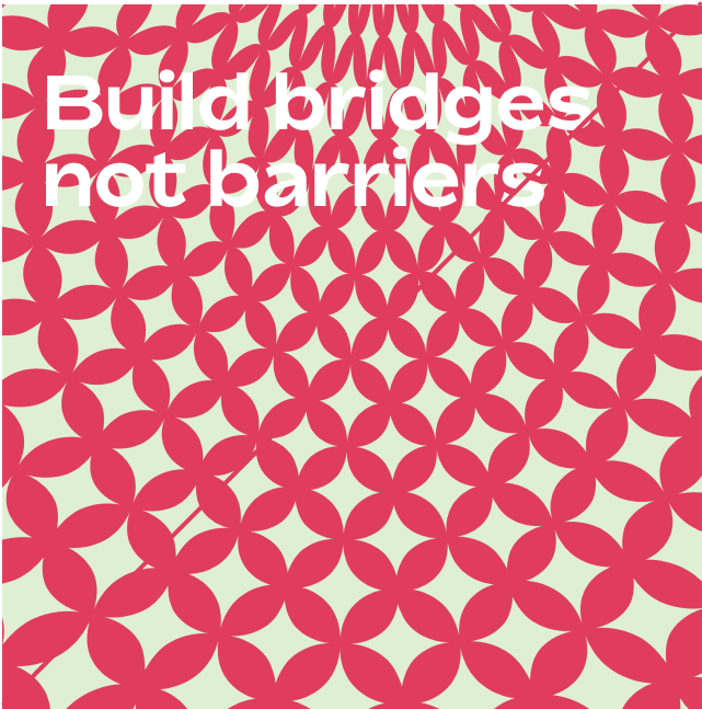
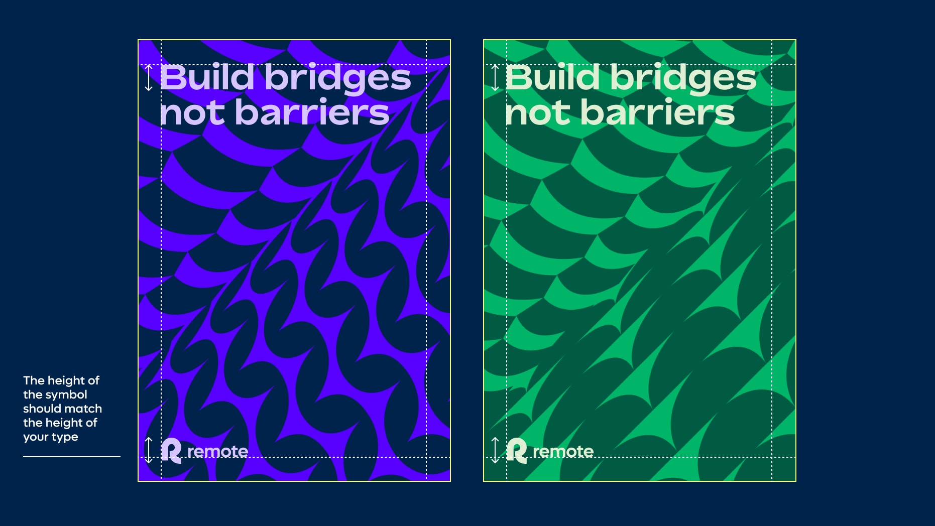
Meeting point layout with type
We use our meeting point layouts when we want to be bold and singular with our type. As patterns can be rich and complex, make sure your type is large and that you are using tonal colour pairings with contrasting colours for your type and logo. Use either left aligned or centrally aligned type and logo.
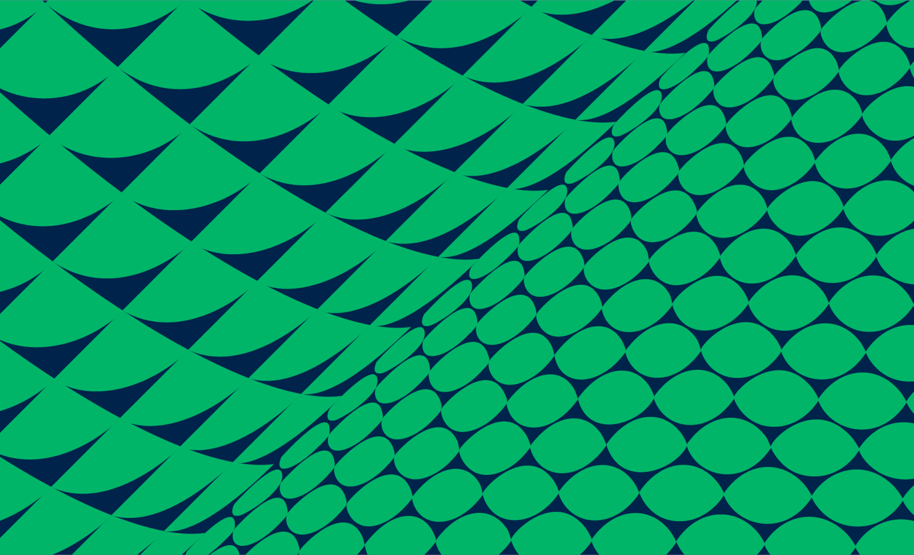
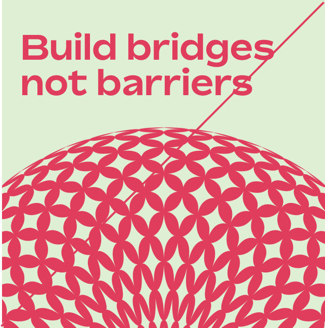
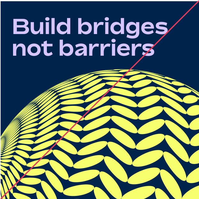
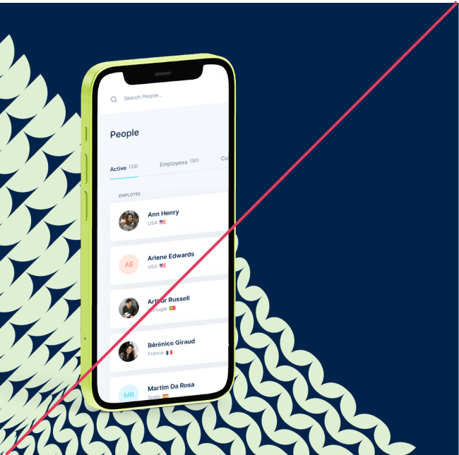
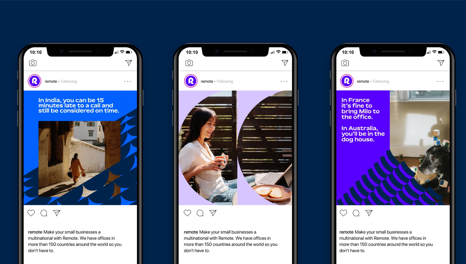
Meeting point layout with images
Things to avoid
To maintain consistency and legibility, please avoid the following mistakes.
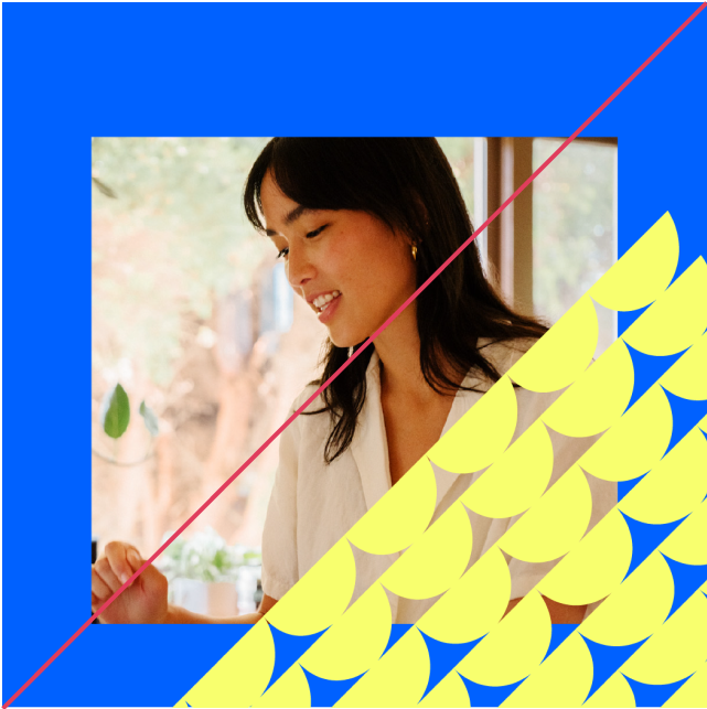
Do not use patterns over images in contrasting colourways
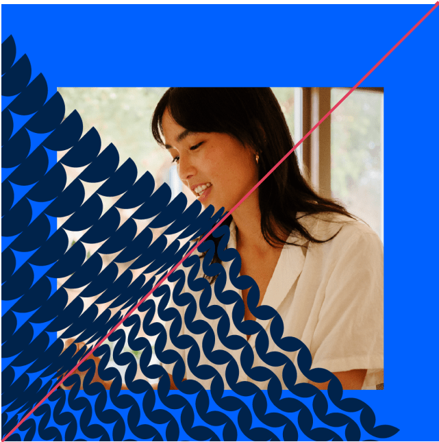
Only use single sides of meeting point patterns in combination with imagery
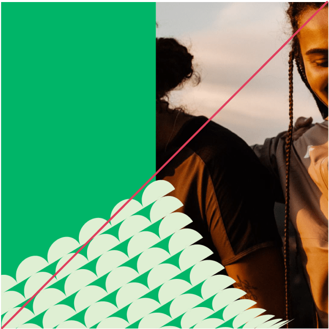
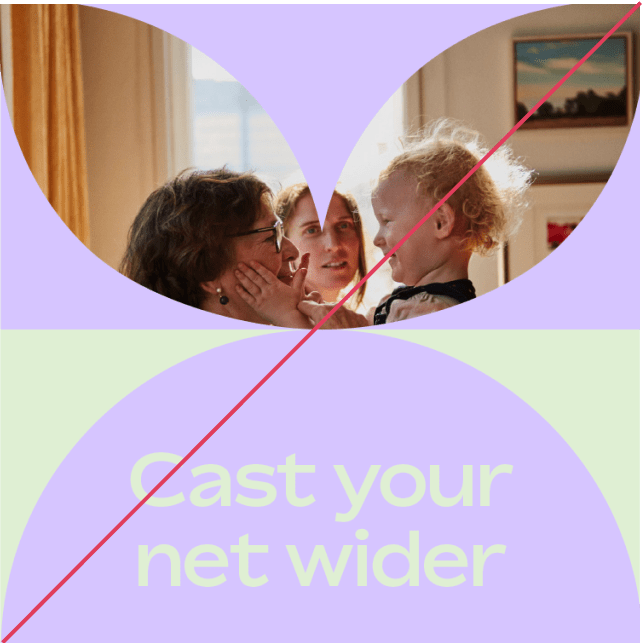
Do not crop your image in a way that obscures the subject matter
Make sure your pattern isn’t too small in relation to your image, and that your image area is not too thin
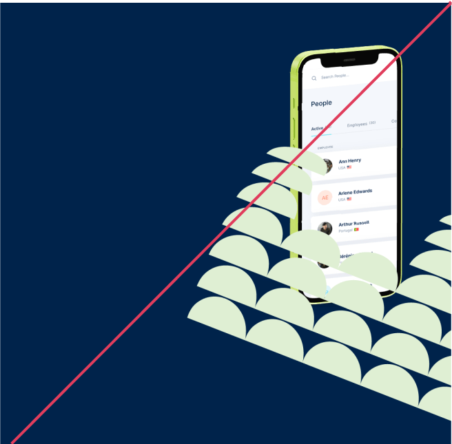
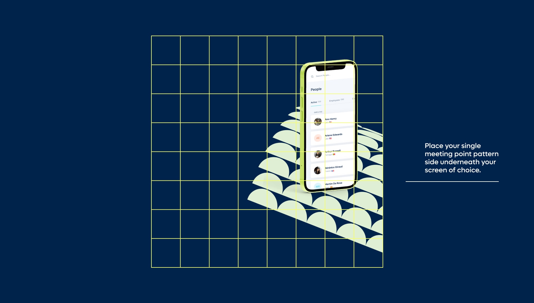
Do not place your pattern above any Remote product screens, it should always be below
Do not use a full double sided meeting point pattern with your Remote product screen
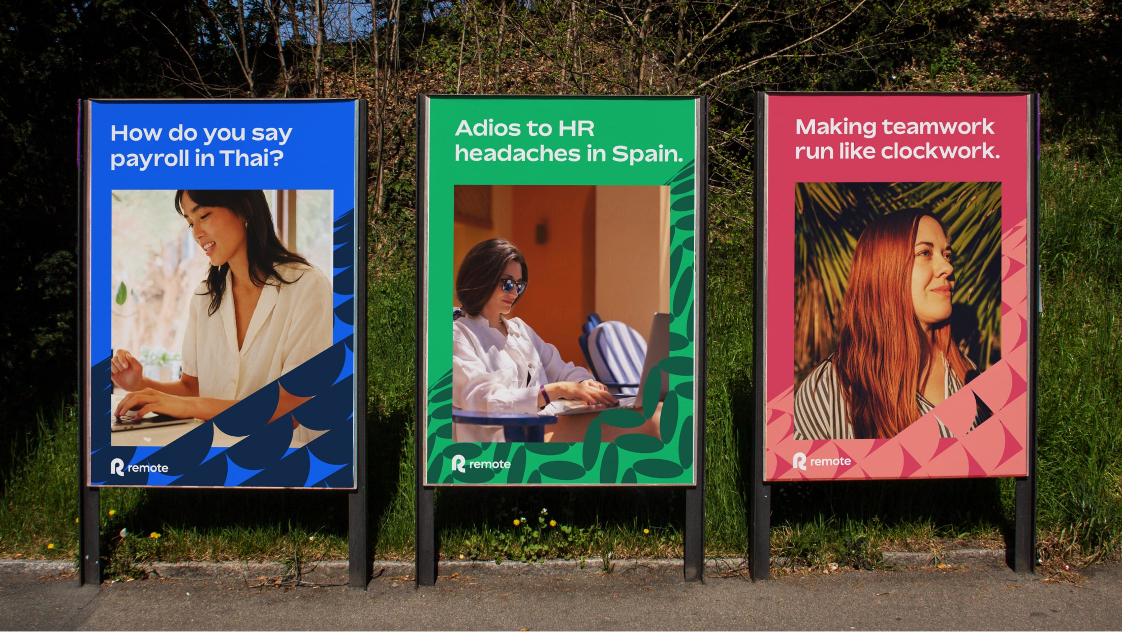
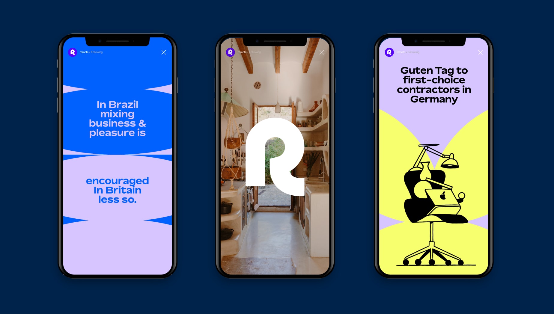
Examples
Iconography